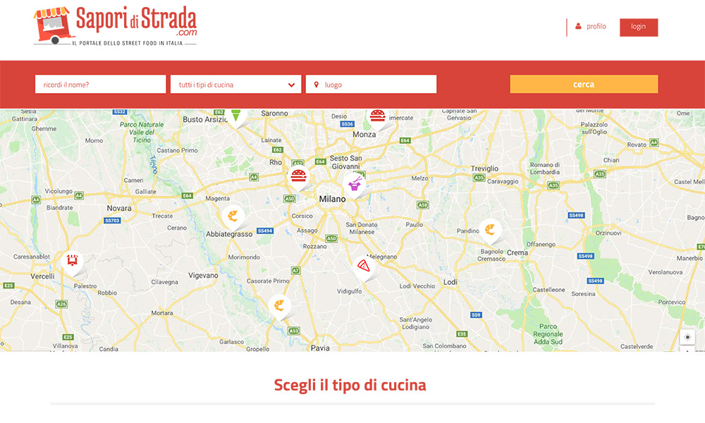
If you have ever looked at the space dedicated to the partners of an event on a poster, you will have noticed that some logos stand out at the expense of others. And yet each of them is given the same graphic treatment (space, colour, distances, etc.).
What makes the difference? The designer’s ability to balance the rules of perception and achieve an effective and convincing synthesis.
However, this value is not enough to ensure the success of a logo.
It must also be recognisable, it must be a faithful interpreter of the values and specific characteristics of the brand’s identity and stand the test of time.

It is also essential that the logo can be used in a variety of versions, for applications ranging from avatars for social media to paper media to cut-outs for stickers or engravings.
A conscious design takes these aspects into account and allows the communicative power of the graphic sign to be maintained in every situation.
When designing a visual identity we therefore adopt a system approach, which takes into account the above.
The graphic design is then rendered in all vector and bitmap formats suitable for all types of use. We also produce application manuals for the correct use of the brand.

We create graphics for flyers, leaflets, business cards, stationery.
Static and animated web banners, website layouts.


